
TL;DR:
- Effective dashboards prioritize clear visuals, real-time data, and actionable metrics tailored to team needs.
- Department-specific dashboards focus on key indicators like pipeline health, campaign ROI, and operational efficiency.
- Successful team dashboards foster accountability and culture change through co-creation and continuous updates.
Choosing the right performance dashboard feels straightforward until you're staring at a demo with 40 widgets, three color themes, and a sales pitch about "actionable insights" that never quite explains what action you should take. Business leaders at mid-sized companies face a real problem: data is everywhere, but clarity is rare. The best dashboards don't just display numbers. They surface the right KPIs at the right time, keep teams accountable, and make decisions faster and smarter. This article walks you through what makes dashboards truly effective, real examples across sales, marketing, operations, and project management, plus a clear comparison to help you choose.
Table of Contents
- What makes an effective performance dashboard?
- KPI tracking dashboards: Sales, marketing, and operations
- Team performance dashboards: Boosting productivity and accountability
- Project management dashboards: Milestones and sprints at a glance
- Comparing popular dashboard tools: Which approach fits your needs?
- Why the right dashboard shapes team culture and results
- Supercharge your performance dashboards with Outsprinter
- Frequently asked questions
Key Takeaways
| Point | Details |
|---|---|
| Focus on actionable KPIs | Effective dashboards highlight the key metrics that drive real business results. |
| Use real-time data | Timely updates ensure decisions are based on current performance, not outdated numbers. |
| Customize by team and role | Tailored dashboards empower executives, managers, and teams to act on the information that matters most to them. |
| Compare tools before choosing | Evaluating dashboard features and strengths side-by-side helps you select the best fit for your company. |
| Dashboards shape team behavior | Good dashboards encourage accountability and collaboration, fueling ongoing improvement. |
What makes an effective performance dashboard?
Not all dashboards are created equal. Many look impressive in a demo but fail in daily use because they were designed to impress buyers, not to help teams perform. Dashboards centralize KPIs and provide at-a-glance team performance monitoring, but only when they're built around the right principles.
Here's what separates high-impact dashboards from the rest:
- Visual clarity: Every chart and metric should have a clear purpose. If a team member needs to ask what a widget means, it's too complex.
- Data freshness: Real-time or near real-time updates prevent decisions based on stale information. Yesterday's numbers aren't good enough when deals close today.
- Customizability: Generic dashboards rarely fit your actual workflows. The best tools let you map metrics to your specific processes and team structure.
- Actionable metrics: Raw numbers without context mislead. Show trends, targets, and variance so users know whether a number is good or bad.
- Integration: A dashboard that can't pull from your CRM, project management tool, or ERP is just a manual reporting exercise.
Understanding performance visualization principles helps you evaluate tools with a sharper eye. Similarly, reviewing concrete performance metrics examples before you buy ensures you're not chasing vanity numbers.
Pro Tip: Always look for dashboard tools that offer role-based views. Executives need strategic summaries. Managers need team-level breakdowns. Front-line staff need task-level clarity. One size rarely fits all three.
The goal isn't a beautiful dashboard. It's a dashboard your team actually opens every morning because it tells them exactly what to do next.
KPI tracking dashboards: Sales, marketing, and operations
With these principles in mind, here's how top-performing teams build functional dashboards for every major department. The most effective ones are built around decisions, not reports.
Sales dashboards track pipeline health, win rates, revenue per rep, and leading activity metrics like calls made or demos booked. The key insight is tracking leading indicators (activities) alongside lagging ones (closed revenue) so managers can coach before the quarter ends.
Marketing dashboards focus on campaign ROI, conversion rates at each funnel stage, and traffic by channel. The best ones make it obvious which campaigns are generating pipeline and which are burning budget.
Operations dashboards monitor efficiency ratios, backlog volume, and turnaround times. For ops leaders, spotting a bottleneck two days early is worth far more than a perfect report delivered too late.

Sales and marketing dashboards help spot trends and trigger fast action to meet targets, which is especially critical in B2B environments where deal cycles are long and pipeline visibility is everything.
| Dashboard type | Key metrics tracked | Primary benefit |
|---|---|---|
| Sales | Pipeline, win rate, revenue per rep | Forecast accuracy and rep coaching |
| Marketing | Campaign ROI, conversion rate, channel traffic | Budget optimization and lead quality |
| Operations | Efficiency ratios, backlog, turnaround time | Bottleneck detection and throughput |
Reviewing specific KPI metric examples for each function helps you avoid the common mistake of tracking what's easy to measure instead of what actually drives results.
Pro Tip: Use color-coding and threshold alerts on every dashboard. Green, yellow, and red status indicators let managers scan a full dashboard in under 10 seconds and know exactly where to focus.
Team performance dashboards: Boosting productivity and accountability
Beyond departmental numbers, performance dashboards can transform the way teams work and own their results. Individual and team-level dashboards close the gap between strategy set at the top and execution happening at the front line.
Tracking key team metrics can boost productivity by 30% or more, and the mechanism isn't mysterious. When people see their own numbers, they self-correct faster than any manager could prompt them to.
Here's a recommended workflow for rolling out team performance dashboards:
- Visualize KPIs for each team member and the group as a whole, including task completion rates, on-time delivery, and sprint velocity.
- Share results weekly in a brief team review. Visibility without conversation is wasted. The discussion is where learning happens.
- Adjust priorities based on data. If the dashboard shows a bottleneck in a specific workflow, shift resources before the deadline hits.
Engagement metrics matter too. Tracking check-in frequency and feedback cycles helps managers spot potential burnout before it becomes attrition. A team member who stops updating their tasks is often a signal worth investigating.
"Teams using transparent dashboards drive a culture of accountability and improvement."
Individual contributor dashboards highlight ownership clearly. When each person can see their own delivery rate alongside the team's, peer accountability kicks in naturally. Understanding how KPIs drive accountability at the behavioral level explains why this works so consistently across different industries and team sizes.
| Team metric | What it signals | Action trigger |
|---|---|---|
| Task completion rate | Throughput and reliability | Below 80%: review workload |
| On-time delivery | Deadline discipline | 2+ misses: check blockers |
| Sprint velocity | Planning accuracy | Drop of 20%+: adjust scope |
Project management dashboards: Milestones and sprints at a glance
Project and sprint dashboards offer visibility into progress and help teams course-correct quickly. Unlike KPI dashboards that track ongoing operations, project dashboards are built around a defined timeline with milestones, deliverables, and a finish line.
The most useful project dashboards include:
- Milestone tracking that shows completion percentage, planned versus actual dates, and which milestones are at risk.
- Sprint boards that separate current work, overdue items, and upcoming tasks so nothing slips through the gaps between cycles.
- Risk heatmaps that assign a severity and likelihood score to blockers, making it easy to prioritize which fires to fight first.
- Status indicators that use simple visual cues (red, amber, green) to give stakeholders a project health summary without reading a full report.
Project dashboards help teams move from excuses to ownership, improving delivery by making delays visible the moment they start, not after the deadline passes.
Exploring KPI and project dashboards built specifically for mid-sized teams gives you a faster path to implementation than building from scratch. And if you're thinking about scaling these practices across multiple teams, reviewing scalable performance management approaches shows you what that looks like in practice.
Pro Tip: Add subtle progress animations to project completion bars. It sounds minor, but visual momentum cues genuinely increase team engagement with the dashboard and create a small, consistent sense of forward motion.
Comparing popular dashboard tools: Which approach fits your needs?
With so many dashboard tools available, summarizing the options with a clear comparison table clarifies your next steps. The right tool depends on your team size, data complexity, and how much customization you actually need versus how much you'll realistically use.
Choosing the right dashboard tool enhances both insight and ongoing ROI, but only when the tool matches your organization's maturity and workflow rather than your aspirations for a future state you haven't built yet.
| Tool approach | Best for | Strengths | Limitations |
|---|---|---|---|
| All-in-one platforms | Mid-sized teams needing KPIs, tasks, and projects in one place | Unified data, lower overhead, faster rollout | Less deep specialization per function |
| Specialized tools | Teams with one core need (e.g., sales analytics only) | Deep features for that function | Siloed data, more integrations required |
| Build-your-own (BI tools) | Large orgs with dedicated data teams | Full flexibility | High cost, long setup time, requires technical staff |
Key factors to evaluate before committing:
- Customizability: Can you configure views without a developer?
- Integration depth: Does it connect to your CRM, project tool, and data sources natively?
- Ease of adoption: Will your team actually use it, or will it become shelfware?
- Pricing model: Per-user pricing scales poorly for large teams. Look for team or org-level pricing.
For teams working through the selection process step by step, a structured performance management steps framework prevents the common mistake of buying a tool before defining what you need to measure.
Why the right dashboard shapes team culture and results
Here's a perspective most dashboard vendors won't share: the tool matters far less than who built it and why. We've seen organizations invest in sophisticated, beautifully designed dashboards that nobody opens after week two. The reason is almost always the same. The dashboard was built for leadership, not for the people doing the work.
The most impactful dashboards we've seen come out of co-creation processes where managers sit down with their teams and ask, "What numbers would help you do your job better?" That question shifts the dynamic completely. Instead of a reporting tool that inspires dread, you get a performance tool that inspires ownership.
A dashboard's greatest power isn't reporting what happened. It's shaping what happens next. Leaders who treat dashboards as living tools, updating them as priorities shift and dropping metrics that no longer drive decisions, consistently see stronger results than those who set and forget. Reviewing a performance improvement guide built for leadership teams reinforces exactly why this mindset shift matters so much.
Supercharge your performance dashboards with Outsprinter
If your organization is ready to move from scattered spreadsheets and disconnected reports to a unified view of what's actually happening, Outsprinter was built for exactly this.
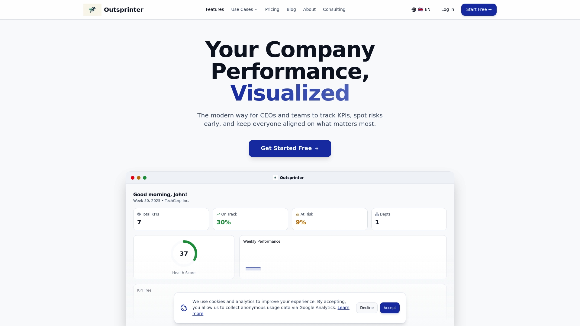
Outsprinter offers pre-built and fully customizable dashboards designed for KPI management software needs across sales, marketing, operations, and project teams. Real-time charts update the moment your team enters data, so you're never making decisions on yesterday's numbers. With built-in project management features, sprint tracking, goal planning, and an AI assistant that turns raw performance data into clear recommendations, the Outsprinter platform gives you everything you need to run a high-performing team without stitching together five separate tools.
Frequently asked questions
What KPIs should I include in a performance dashboard?
The most effective dashboards track metrics directly tied to business goals, such as revenue growth, task completion rates, or customer satisfaction scores. Essential KPIs vary by team function, so start with your top three priorities per department before adding more.
How often should dashboards update their data?
Near real-time updates are the gold standard, but daily refreshes are the minimum for meaningful decision-making. Frequent dashboard updates give teams current information and prevent managers from acting on outdated signals.
Can performance dashboards improve team motivation?
Yes. Transparent dashboards create accountability by making progress and bottlenecks visible to the whole team, not just leadership. Dashboards influence behavior in measurable ways, often reducing late deliverables and increasing self-directed improvement.
What is the biggest mistake to avoid when creating dashboards?
Overloading a dashboard with too many metrics is the single most common failure. Too many metrics overwhelm teams and shift focus away from what actually drives decisions.
How do I choose the right dashboard tool?
Prioritize customizability, native integration with your existing systems, and ease of adoption for your team. Dashboard software selection should always start with your current workflows, not a vendor's feature list.
Recommended
- Outsprinter - Team Performance & Sprint Management Platform
- How High-Performing Leadership Teams Use KPIs Differently | Outsprinter
- KPI Management Software | Real-Time KPI Tracking & Dashboards | Outsprinter
- KPI Management Blog - Expert Insights & Best Practices | Outsprinter
- How to manage remote teams for productivity and engagement